Chapter 6
Photo Gallery
Display Options
Right: ready for the next round? It's a matter of again copying the coding from an earlier page (I used activities.html) and editing it to form the basis of the new file. But hold on: we need a slightly new structure first.
- Go to your file list in the maa folder: set up a new directory or folder alongside the other files that we've been dealing with.
- Name the new folder pics (we're going to put a lot of pictures into it). Some folk like all their files to be as descriptive as possible so they might opt for a much more elaborate name, MAA_Gallery_Photos perhaps. It's up to you of course, but long file names can get a bit tedious when programming as well as when specifying them in a browser.
- Move into the new pics directory.
- Save a blank txt file as gallery.html within that new folder.
- Set up the head and tail ready for the new page, as follows.
BUT EXPLANATION FIRST:
The menu section is different of course, but a different difference this time. Once the page is up and running there will be no other html page files in the pics directory. So in order to get back to the home (index), membership, activities and contact pages the browser will need to move back up the file structure into the directory that holds them, maa. Dot, dot, slash ../ is what gives the 'go back' instruction. The (only) other alternative would be to use the full URL (Universal Resource Locator, address) for each of the destinations within the menu. ../ not only saves us a lot of typing, it still functions correctly when all our files have been uploaded onto the web with new addresses. Phew!
<!DOCTYPE html>
<html lang="en">
<head>
<meta http-equiv="Content-Type" content="text/html;charset=utf-8">
<title>MAA Picture Gallery</title>
<meta name="description" content="Mudcomb Activities Association picture gallery.">
<link rel="stylesheet" type="text/css" href="maastyle.css">
</head>
<body>
<div class="header">
<table><tr><td><img src="MAA.jpg" alt="MAA monogram." style="height:60px;"></td>
<td style="font-size: 55px; font-weight: bold;">MUDCOMB ACTIVITIES ASSOCIATION</td></tr>
<tr><td colspan="2" style="font-size:30px;">
<a href="../index.html">Home Page</a>   •  
<a href="../members.html">Membership</a>   •  
<a href="../activities.html">Activities</a>   •  
<a href="../contact.html">How to contact us</a></td></tr></table>
</div><br>
<div>
</div>
<br><hr></body></html>
<!-- Website Primer, Chapter 6, gallery.html -->
Save it, as usual. It was thanks to our foresight at the planning stage that our new file was "pics/gallery.html" on the menus. Does that work alright now? Can you move to and fro between the various pages alright (other than Contact)? Fine.
Obviously, this Chapter is going to be about pictures. We already know a bit about them: we included, sized, bordered and positioned an image in MyFirstCSS.html. But we need to look at other ways of combining text and pictures and of setting up different patterns of images on the page. We'll start with an easy one: how can an image fill the full width of the page when we don't know, in figures, how wide the page is? Answer: 100%: include width: 100%; in the img style details – on a par with the table in the now familiar page header. Any such percentage figure relates to the ambient space, so if wide margins have been set its the percentage of what's left in the middle. (It will work with images within tables, but you'd need to experiment to find the proportions you needed.)
But there is another way of doing it with CSS. Nip across to your maastyle.css and add this -
| .full | | {width: 100%;} |
| .left | | {float: left; margin-right: 15px;} |
| .right | | {float: right; margin-left: 15px;} |
Notice the vital fullstop on each one: it defines a 'class' in CSS (as we did with some colors in members.html). We'll look at left and right in a moment, but back on gallery.html we can now insert our full-width picture like this -
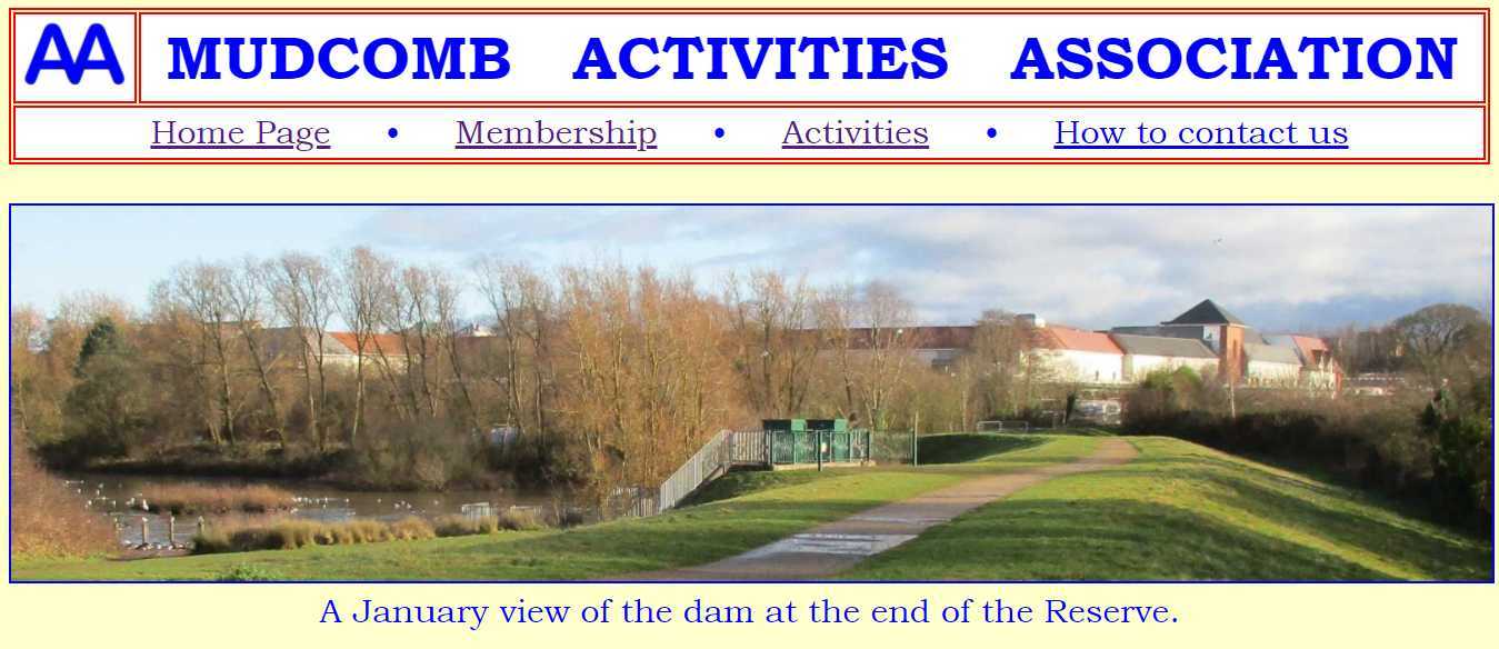
<div style="text-align:center;">
<img src="FullWidth.jpg" alt="January scene." class="full">
A January view of the dam at the end of the Reserve.<br><br>
</div>
That will work alright. As the picture is full width it doesn't need the align center instruction, but the text does! As always, you'll substitute a suitable image of your own with appropriate alt text and description.
But we haven't specified a border. We really do need to, especially with any overcast scene showing a blank sky. We can specify border color and width, as we did in MyFirstCSS.html. Generally speaking though, the border is best kept within modest bounds: it shouldn't be a feature in its own right, detracting from the actual image. In our present context we don't really want a whole variety of different borders so we may as well stick to one border specification throughout this page, not necessarily the whole site. And we know exactly how to do that - with an internal style sheet command in the head section.
<style> img { border-style: solid; border-width: 2px; border-color: blue; } </style>
- ought to fit the bill.
 Ooops! That also puts a border round the MAA monogram in the header. It's just on this page so does that really matter? Can we correct it? Yes, with in-line CSS: add a border-style:none; instruction -
style="height:60px; border-style:none;"
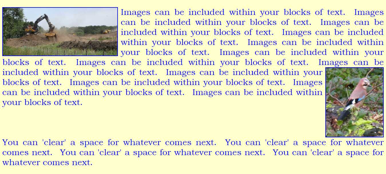
Another possibility is that you may want to insert some more modest pictures in amongst whole masses of text, as I did just now with the "Ooops!" paragraph. That's where the float function comes in.
| .left | | {float: left; margin-right: 15px;} |
| .right | | {float: right; margin-left: 15px;} |
<div>
<img src="Siteworks.jpg" alt="Excavator at work." class="left" style="width:400px;">
Images can be included within your blocks of text. Images can be included within your blocks of text. Images can be included within your blocks of text. Images can be included within your blocks of text. Images can be included within your blocks of text. Images can be included within your blocks of text. Images can be included within your blocks of text. Images can be included
<img src="Jay.jpg" alt="This bird is a jay." class="right" style="width:200px;">within your blocks of text. Images can be included within your blocks of text. Images can be included within your blocks of text. Images can be included within your blocks of text. Images can be included within your blocks of text.
<br style="clear:right;">
You can 'clear' a space for whatever comes next. You can 'clear' a space for whatever comes next. You can 'clear' a space for whatever comes next. You can 'clear' a space for whatever comes next. <br><br></div>
The style command is added to whatever comes next, <br> in our case. It can be "clear:right;" or "clear:left;" or "clear:both;", as needed - right in our case. Then the effect is -
In this next section we'll deal with thumbnails - reduced images of pictures - and with using pictures (thumbnails coincidentally) as links to other pages (containing the full-sized pictures coincidentally).
What we want is a table containing the small images: we'll use the straightforward height measurement to set the size. To make the img serve as a link it has to have img src included in the corresponding <a listing. And as we want it to open in a new tab we need the target too. So each td table data line in our table coding will be rather lengthy -
<td><a href="Beech2.jpg" target="_blank"><img src="Beech2.jpg" alt="Beech view 3." height="150"></a>   </td>
- for one or other of the images. You'll recognise   as providing spaces between those thumbnails. (But why does Beech2.jpg have alt Beech view 3? Because I was showing off when I stored the pictures originally: I named them Beech0 to Beech4. I copied aficionados of computing who like to start lists at zero perhaps because the whole enterprise actually relies on ones and zeroes. In any case, you yourself started life at age zero: it wasn't until a year later that you celebrated birthday number one!)
Here it is in full:
<div style="text-align:center;">
<table style="margin-left:auto; margin-right:auto;"><tr>
<td><a href="Beech0.jpg" target="_blank"><img src="Beech0.jpg" alt="Beech view 1." height="150"></a>   </td>
<td><a href="Beech1.jpg" target="_blank"><img src="Beech1.jpg" alt="Beech view 2." height="150"></a>   </td>
<td><a href="Beech2.jpg" target="_blank"><img src="Beech2.jpg" alt="Beech view 3." height="150"></a>   </td>
<td><a href="Beech3.jpg" target="_blank"><img src="Beech3.jpg" alt="Beech view 4." height="150"></a> &emsp lt;/td>
<td><a href="Beech4.jpg" target="_blank"><img src="Beech4.jpg" alt="Beech view 5." height="150"></a></td>
</tr></table>
Click on any thumbnail to see the bigger picture.<br>
You'll come back here automatically when you close the biggie.
<br><br></div>
And here's what appears:
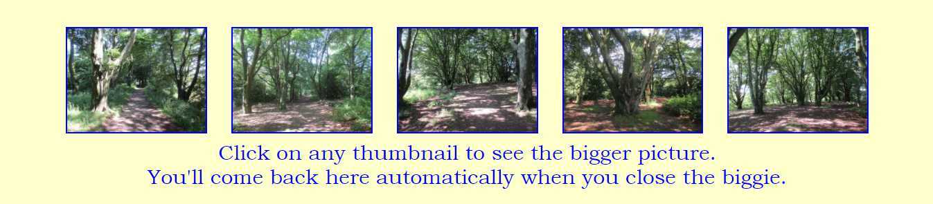
And that's it - there's no coding involved in bringing the browser display back: it's automatic, as it says.
Let's experiment with another system, to produce the kind of layout sometimes favoured in catalogues, with a tabulation of pictures each with its own text - price and size or whatever. There are a number of ways of doing it, but as we're already fairly familiar with tables we may as well take the simplest. The only constraint here is that if the display is to look neat and tidy there must be some way of keeping them lined up even if they have different sized images or different amounts of text. This is done with td {vertical-align:top;} in the head (or in maastyle.css if you want it to be a universal rule). So our internal style sheet now reads -
<style> img { border-style: solid; border-width: 2px; border-color: blue; }
td { vertical-align: top; } </style>
The rest of my html - you can assemble your own - is:
<div style="text-align:center; font-size:20px;">
<table style="margin-left:auto; margin-right:auto;"><tr>
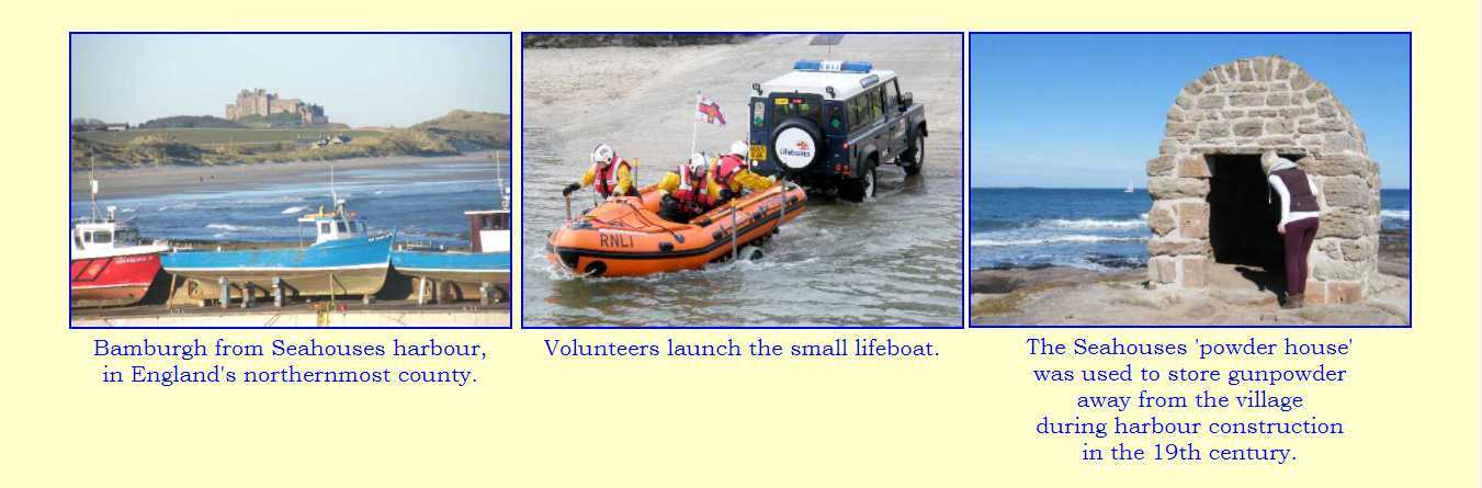
<td><img src="Bay.jpg" alt="Across the bay to the castle." width="95%"><br>
Bamburgh from Seahouses harbour,<br>in England's northernmost county.<td>
<td><img src="Boat.jpg" alt="Launching the small lifeboat." width="95%"><br>
Volunteers launch the small lifeboat.</td>
<td><img src="House.jpg" alt="Seahouses 'powder house'." width="95%"><br>
The Seahouses 'powder house'<br>was used to store gunpowder<br>away from the village<br>during harbour construction<br>in the 19th century.</td></tr></table>
<br><br><div>
So that's as far as we go. There are countless other possibilities: tables are more usually multi-row, for example. You'll be able to manipulate your new-found html and css to deal with whatever you fancy.
We'll finish our Mudcomb pages in
Chapter 7 >
<<<<<<<<<<+>>>>>>>>>>